

Screen mockups using Pear design system components
Pear OS
As part of a Mobile Application Design class, My team and I designed a reimagined OS for a foldable device with a split screen experience as its key feature. We called it Pear, kind of as a playful twist on the word “pair”. I led the team working on the design system for much of the project duration followed by a short stint working with the maps team.
Note: As this project was done before the launch of the Samsung Galaxy Flip, we could arguably stake a claim as pioneers of the foldable device space. Just saying.


These were rough mockups and frames of the device that we were designing for. We were encouraged to account for different states of folds and device orientation in our designs.
Design Systems
With multiple teams working across 15 seperate core apps to build Pear OS, it was critical that we had a single, living, breathing, source of truth that we could all fall back on to ensure consistency across our designs. I led the design systems team where we built components and established the look and feel of our design language.

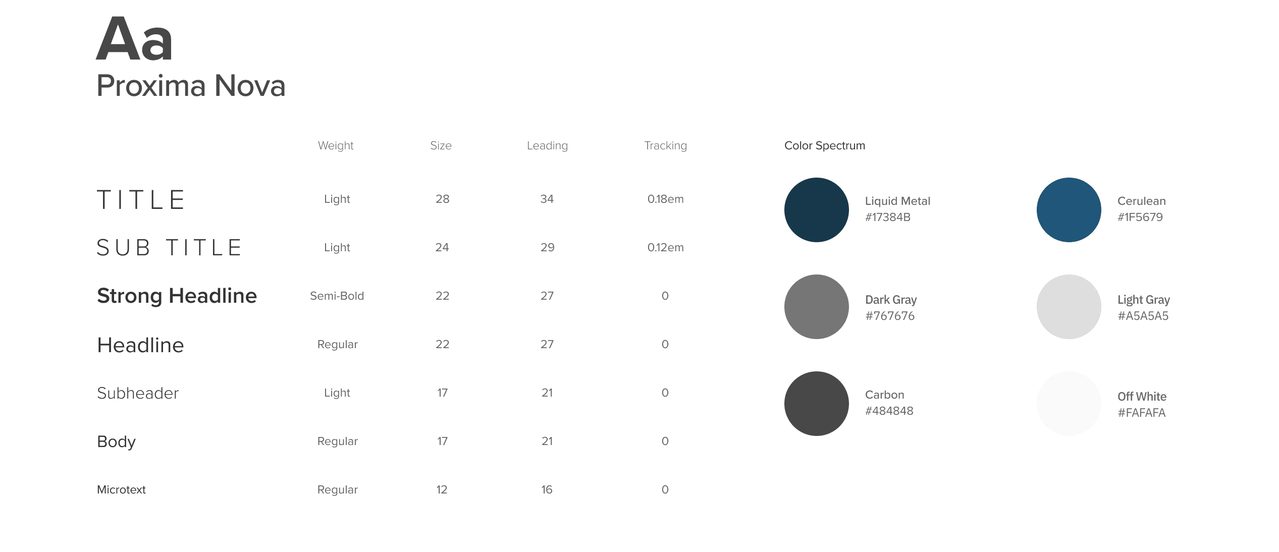
Rough style guide of colors and typefaces used in Pear.
Component Library
As part of our deliverables, we created a component library with what we thought would be most commonly used components. This helped ensure adherence to design language and consistency across the various apps as teams would be able to utilize common components to rapidly mockup their screens.


A sampler of some of the components put together as part of deliverables. We included many of the usual suspects including nav bars, list items, tool bars, cards, search bar, buttons, switches, inputs, forms etc.


We'd also put together a small number of generic mockups to serve as a visual reference or mood board of sorts, to help provide a sense of the look and feel of the design language.
A Slight Detour
As the design system matured and got to a good place, I had the opportunity to jump in with the team working on a Maps app where we explored ways and means to utilize the expanded screen real estate that a foldable device afforded us.


Reflections
This was my first time building a design system and it was definitely a valuable learning experience. One of the design principles that we adopted with Pear was to be distinctive. This actually came about after our first iteration got mixed reviews and was cited as "being too similar to what's out there".
Following that review, I took the initiative to redraw the whole thing. Using the colors "Liquid Metal" and "Cerulean" (identified in style guide above) as starting points, I laid the foundations of Pear in its current form and built it around the idea of cool minimalism.
Being my first design system, there are many things that I would have done differently. I didn't understand how to establish a consistent vertical tempo, there were inconsistencies that do not quite fit the visual style etc. But most crucially I don't think Pear was as versatile as it needed to be, especially as it had to service 15 core applications with vastly differing goals and objectives. I had inadvertently put a voice in Pear that may have hamstrung some of the other teams.
Nonetheless, this was an extraodinarily rewarding experience and seeing other people create apps to fit within the ecosystem was invaluable in helping me understand the role that design systems play and the need to consider the bigger picture in whatever we do.